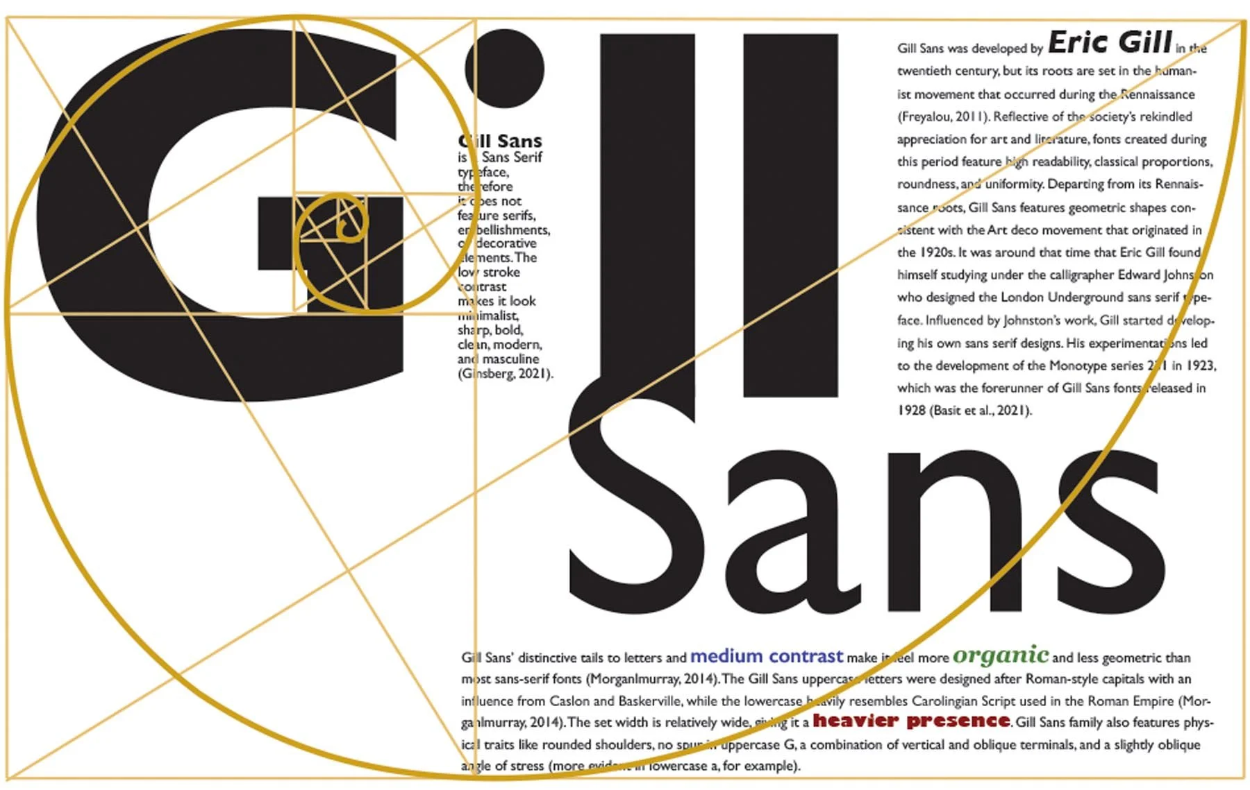
Homage to a Font
Project created for GRA-340 at Southern New Hampshire University

Tools InDesign, Photoshop, Illustrator, Golden ratio
Brief
“Homage to a Font” is a poster I designed using Adobe InDesign and Photoshop. The goal was to utilize type, which included the history, characteristics, and era of the chosen font, to create an engaging and creative layout. I used the visual hierarchy of text to establish visual dominance. I submitted the final design as a one-page, 300 PPI landscape PDF with a total size of 17 x 11 inches.
Design process
I started my project by researching the history and characteristics of the chosen font. Various online sources such as talkpaperscissors.info and fonts.com proved helpful in understanding the specific qualities of my chosen font. Having learned that despite it being rooted in the Renaissance, Gill Sans is a modern typeface featuring radical geometric shapes (especially when set in a bold font style and a large point size), I decided that a blocky modern-looking poster with sharp shapes would complement the geometric nature of the font and represent it well.
My first design decision was to make the font’s name the focal point of my layout. The idea behind splitting and staggering the words “Gill” and “Sans” was that English speakers are used to a left-to-right reading gravity which follows a diagonal path that connects the top left corner to the bottom right corner of the layout. Placing important information outside of the reading gravity path tends to disturb the reading rhythm. The reading gravity is also why I decided to left-align the copy within my blocks of text, thus creating sharp vertical edges that run parallel to the heavy vertical strokes in “Gill.”
To keep the viewer engaged, I replaced the stem in lowercase “i” with a column of text featuring reduced leading for a smoother edge and a darker appearance. Due to the Gestalt principle of closure, which states that our brains are wired to fill in the blanks to complete an image, the viewer can still recognize the missing part of the letter “i” and read the entire word. Similarly, the brain can easily break apart the shape created by the fusion of “l” and “S” in order to perceive them as two different letters.
The most important design principle I had to employ in this project was the typographic hierarchy. I used ample negative space and several variations of the featured typeface for a strong hierarchy in my layout. Notably, my poster follows the Golden Ratio proportions. I overlayed the “golden spiral” on my poster and used it as a guide when deciding on the size and placement of the copy. Following the 1:1.618 rule helped create an eye-catching and balanced layout.

